In the world of digital branding, every pixel counts — and that includes the case of how your URLs look on marketing materials. While the technical side of the web might treat all domain names equally, the visual presentation can make a big difference in how it’s perceived, remembered, or visited.
DNS is case insensitive — but humans aren’t
Here is the technical truth: the Domain Name System (DNS) is like a big phonebook. (Do you remember those?) It pairs up the friendly domain names we love as people to the rather forgettable and ugly numbered addresses computers love.
DNS is case insensitive. So whether you enter a web address from memory, a business card, one shown in a TV spot, or seen in a print advertisement: ExampleDomain.com, exampledomain.com, or EXAMPLEDOMAIN.COM are all the same to “the machines”. A domain name is always interpreted as lowercase.
The human eye and mind isn’t so clear cut. Humans read and interpret letter case so when it comes to marketing — quick recognition, legibility and recall are key. Here are two best practice on how to “make the case” for your own domains and if needed full webpage addresses. Both aspects require different approaches.
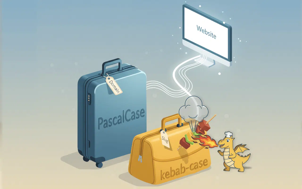
PascalCase: a visual strategy for domains
When it comes to making domain names as legible as possible, PascalCase is the smart strategy. This is where the domain name is compounded (smushed) together into a single phrase and the first letter of each word capitalized. Like this: ExampleDomain.com.
This method respects the spirit of how domain names have and still are traditionally displayed — as a single string of characters. The spin comes by capitalizing the first letter of each word which allows a reader to easily pluck-out and decipher them.
However this approach should not be used for longer webpage URLs as the portions after the domain name are case sensitive. ExampleDomain.com/aboutus and ExampleDomain.com/AboutUs are two different addresses. It’s okay, there is a great answer to this problem in just a couple of paragraphs!
Using the PascalCase approach helps the target audience remember your top-level domain in a time where they are bombarded with 4000-10,000 messages. Every. Single. Day. When they can remember the domain name as a series of demarked words — even after zipping past a billboard at 100km/h or tearing past a transit shelter ad to catch that bus — the better the chance they will visit your site later.
So, to recap:
✅ PascalCase style: MyGreatBigExampleDomain.com
❌ Internet style: mygreatbigexampledomain.com
The Pascal approach is instantly easier to read on any printed marketing collateral: billboard, presentation, social media post. 🔔Remember: Pascal is only beneficial when applied to the naked (apex) domain itself and not anything after that first slash. For that we want to talk about kebabs, dashes and proper slug notation. Let’s get into it.
Slugs are a different story: Stick to kebab-case here
While the Pascal method works well for visually displaying apex domain names in print and other media, it’s not suitable or recommended for ‘slugs’. (The ‘slug’ is the part of the URL that comes after the domain like /about-us or /contact etc. and defines the actual webpage within a domain a user would visit.)
Why? Slugs are case sensitive. Therefore we want a standardized approach to creating them that avoids inadvertently making same named pages that differ only by capitalization. Falling into this trap will serve confusion to both user-centric experience (UX) and impede Search Engine Optimization (SEO) efforts.
The solution is kebab-case. This mandates all lowercase letters that are conjoined with dashes like “/read-about-us”, just as if they have been skewered together ready for the grill.
You can see below how kebab-case towers over other potential options:
✅ /our-products
❌ /ourproducts (readability, SEO sees a single word)
❌ /our_products (SEO sees a single word, ignores underscore)
❌ /our products (shows as /our%20%products in browsers, bad UX)
❌ /OurProducts (different page than “ourproducts” above)
❌ /ourProducts (yet another page v. “OurProducts” and “ourproducts”)
Kebab improves readability and UX for people and is translated to space-equivalency by search engines and screen readers so keywords can be independently evaluated and ranked. This approach respects people’s comprehension, fosters less typos when manually entered, and satisfies compliance for both SEO and accessibility standards.
Let’s pull it all together
We’ve learned there are various ways to display and structure website domain names, page locations (collectively the URL). Each with their own benefits. Here’s a quick recap:
- PascalCase: Looks polished, professional and helps reinforce branding and human recall when trying to remember a website address when shown in print or other media.
- Kebab-case: The best and most-powerful choice for the slug portion of a web address and foster standards compliance and reduces errors when typing them in. These also tend to be lengthier so a separator is also beneficial.
- User Experience: Although the two look very different, they offer consistently clear formatting that reduces confusion, improves recall and fosters click-through rates. Pascal takes care of the first half, Kebab the second.
Go forth and smush and skewer your way to web publication perfection with the best of both worlds. When printing URLs, using Pascal for the domain name portion and kebab-case for the slug or filename portion maximizes legibility for human eyes. For example, MyPerfectDomain.com/special-offer-for you on a post card or bus ad is just, well, perfect!
Curious about how we approach websites? Learn more: Websites.
Last Updated: February 13, 2026